Case Study —03 / 05
Foundry Design System
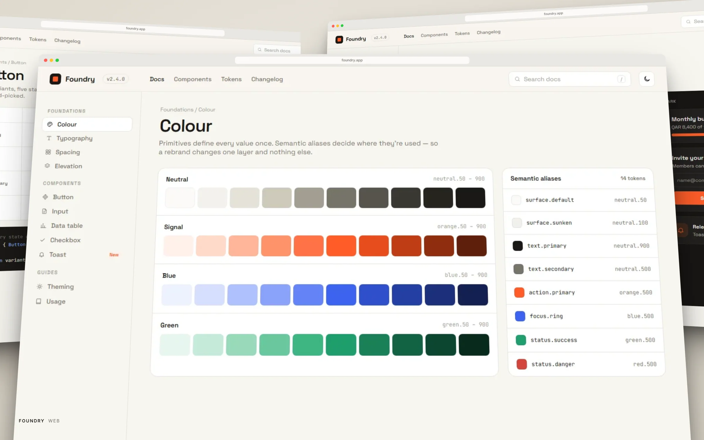
Overview
Product
Cross-team design system
Client
Internal platform, adopted across 3 product teams
Role
Design system lead — tokens, components, documentation
Timeline
Ongoing since Feb 2025
Responsibilities
Token architecture, Component API design, Figma ↔ code parity, Adoption & documentation, Contribution model
Problem
Three teams, three buttons, zero shared source of truth
Each product team had grown its own set of components independently, which meant every visual inconsistency — a button radius, a spacing scale, a color that was almost-but-not-quite the brand orange — had to be found and fixed by hand, team by team, screen by screen.
Design and engineering were also drifting apart: Figma components and their coded counterparts had no enforced relationship, so 'ships to spec' was a matter of individual diligence rather than the default outcome.
Challenge
A system that teams adopt because it's faster, not because it's mandated
A design system that has to be enforced top-down is already losing. The real challenge was making Foundry the path of least resistance — components that were easier to reach for than to rebuild, documentation that answered the question a developer actually had, and a contribution model that let teams add what they needed without forking.
Token architecture had to support two live products with different accent colors on the same base system, so primitives and semantic tokens needed a clean, provable separation from day one.
Approach
Research
Audited every existing component across the three teams' codebases and Figma files, categorizing genuine variation from accidental drift.
Token architecture
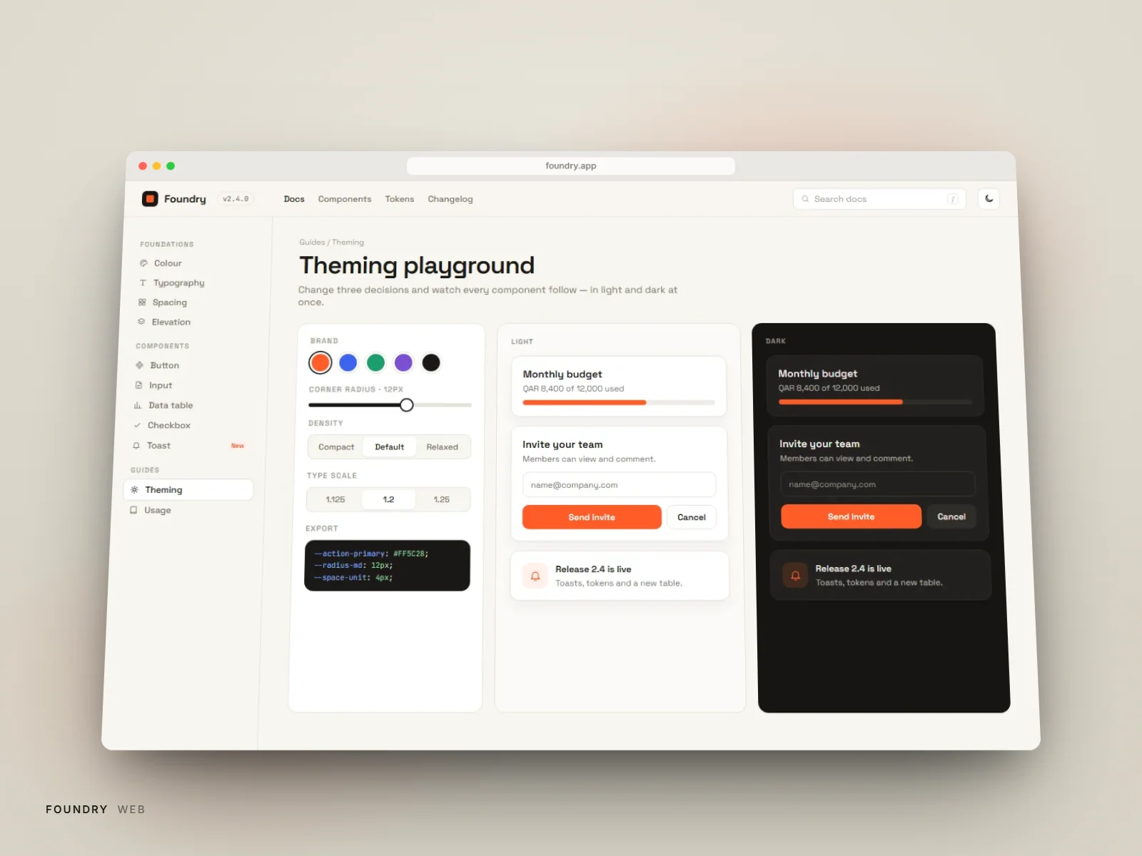
Defined a two-tier token system — primitive values and semantic aliases — so a product-level accent swap never touches a component's internal logic.
Component design
Designed each component's variant matrix in Figma with the exact prop surface engineering would implement, reviewed jointly before either side built anything.
Figma ↔ code parity
Wired components to the same token names on both sides so a design change and a code change are, by construction, the same change.
Adoption
Migrated the two highest-traffic surfaces first as reference implementations, then opened a lightweight RFC process for teams to propose additions.
Anatomy
Documentation built from the same layers the system ships
Scroll to take the screen apart ↓
- 01Surface
- 02Imagery
- 03Cards & containers
- 04Typography
- 05Controls
- 06Navigation
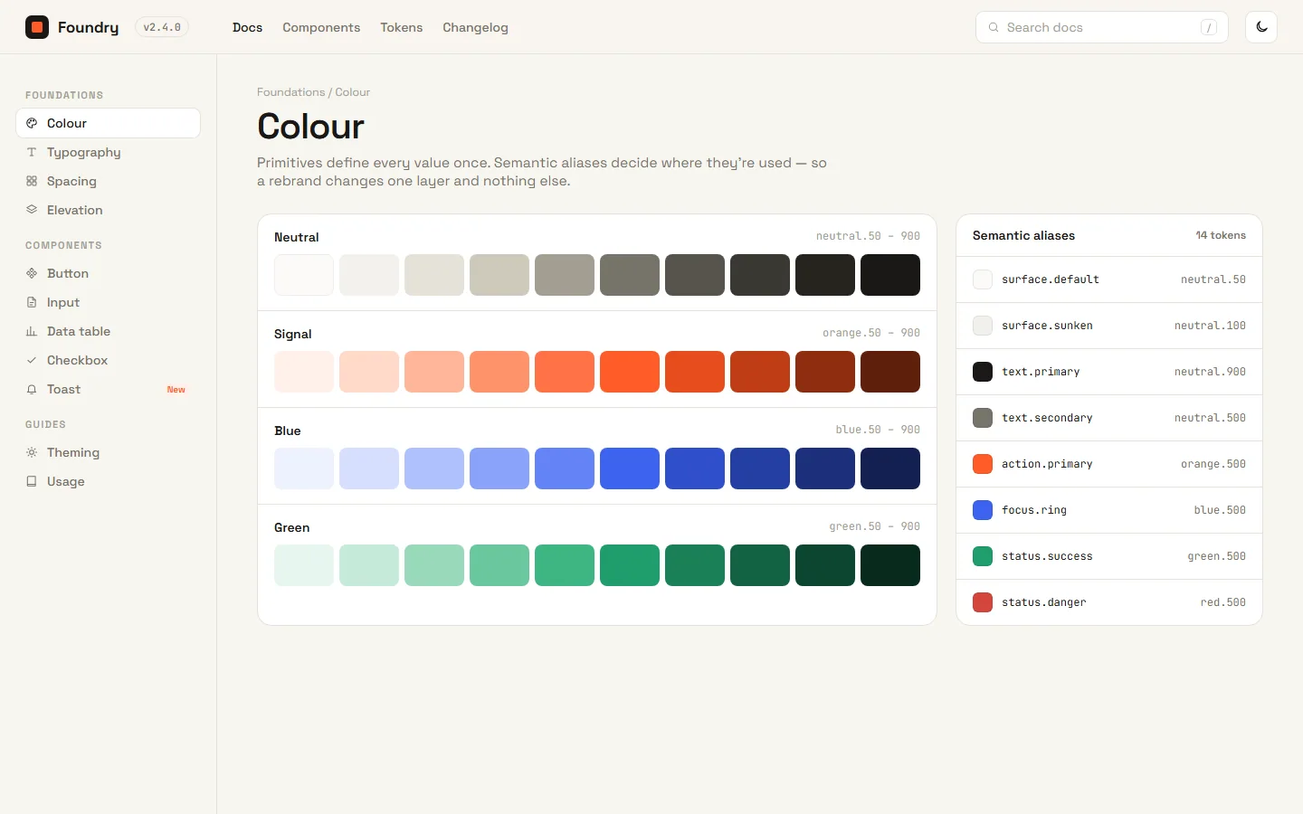
- 01Surface
- 02Imagery
- 03Cards & containers
- 04Typography
- 05Controls
- 06Navigation
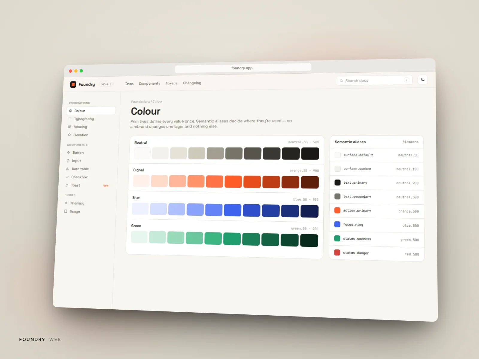
Primitive tokens on the left, semantic aliases on the right — one is allowed to change without touching the other.
Gallery
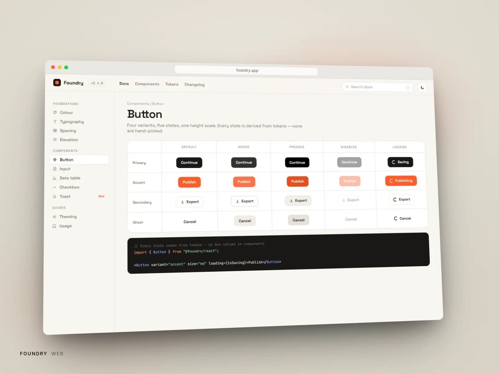
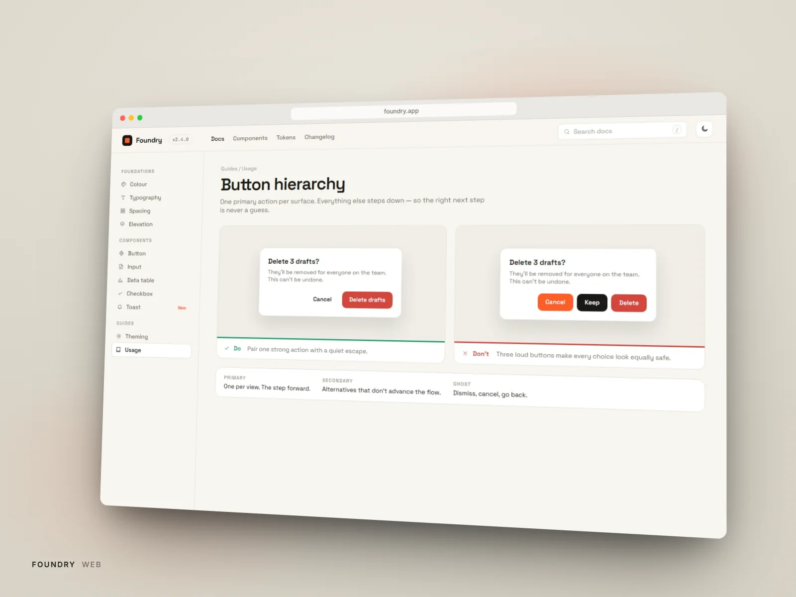
Button component variant matrix
Design System
Tokens
- space-1 … space-84px base scale, 1.5× ratio
- radius-sm / md / lg2px / 6px / 12px
- color.accent (semantic)→ product-level primitive
- elevation-1 … elevation-3layered shadow tokens
Typography
- Type scale expressed as semantic roles (display / heading / body / caption), never raw pixel values, in both Figma and code
- Every product maps its own display font onto the same role names
Components
- Button (5 variants × 3 sizes)
- Form field set (input, select, textarea, checkbox)
- Data table with sort and density controls
- Toast & inline alert
- Modal & drawer
Results
Tokens first
Every component themed from one semantic layer
Shared
Library contributed to by the product teams that use it
Faster
Design–engineering handoff per feature
Next Project